flexbox
布局的传统解决方案,基于盒状模型,依赖 display属性 + position属性 + float属性。它对于那些特殊布局非常不方便,比如,垂直居中就不容易实现。
2009年,W3C提出了一种新的方案—-Flex布局,可以简便、完整、响应式地实现各种页面布局。
Flex是Flexible Box的缩写,意为”弹性布局”,用来为盒状模型提供最大的灵活性。
任何一个容器都可以指定为Flex布局。
.box{
  display: flex;
}
行内元素也可以使用Flex布局。
.box{
  display: inline-flex;
}
Webkit内核的浏览器,必须加上-webkit前缀。
.box{
  display: -webkit-flex; /* Safari */
  display: flex;
}
注意,设为Flex布局以后,子元素的float、clear和vertical-align属性将失效。
虽然 Flexbox 非常适合缩放,对齐和重新排序元素,但以下情况应该尽量避免使用 Flexbox 布局:
整体页面布局
2.完全支持旧浏览器的网站
旧版浏览器,如IE 11或更低版本,不支持或仅部分支持 Flexbox 。如果你想安全的使用页面正常呈现,你应该退回到其他的 CSS 布局方式,比如结合float 的 display: inline-block 或者 display: table等。但是,如果您只针对现代浏览器,那么 Flexbox 绝对值得一试。
-
基本概念
采用Flex布局的元素,称为Flex容器(flex container),简称”容器”。它的所有子元素自动成为容器成员,称为Flex项目(flex item),简称”项目”。
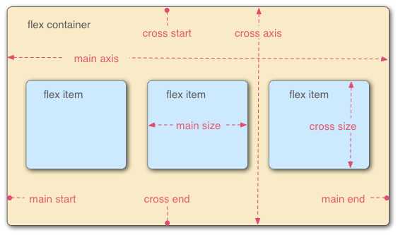
容器默认存在两根轴:水平的主轴(main axis)和垂直的交叉轴(cross axis)。主轴的开始位置(与边框的交叉点)叫做main start,结束位置叫做main end;交叉轴的开始位置叫做cross start,结束位置叫做cross end。
项目默认沿主轴排列。单个项目占据的主轴空间叫做main size,占据的交叉轴空间叫做cross size。
-
属性
- flex-direction
默认横向
<!DOCTYPE html>
<html lang="en">

<head>
    <meta charset="UTF-8">
    <meta name="viewport" content="width=device-width, initial-scale=1.0">
    <meta http-equiv="X-UA-Compatible" content="ie=edge">
    <title>Document</title>
</head>
<style>
    .flex-container {
        display: flex;
    }
    /* 以下为辅助样式 */

    .flex-container {
        background-color: #F0f0f0;
    }

    .flex-container .flex-item {
        padding: 20px;
        background-color: #B1FF84;
    }

    .flex-container .flex-item:first-child {
        background-color: #F5DE25;
    }

    .flex-container .flex-item:last-child {
        background-color: #90D9F7;
    }
</style>

<body>
    <div class="flex-container">
        <div class="flex-item">1</div>
        <div class="flex-item">2</div>
    </div>
</body>

</html>
flex-container添加:flex-direction: column;
会显示为纵向排列
也可以通过设置 flex-direction: column-reverse 或 flex-direction: row-reverse 来使 flex 项以相反的顺序排列
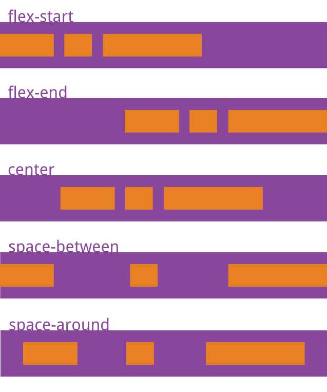
- justify-content
justify-content属性定义了项目在主轴上的对齐方式。
.flex-container {
        display: flex;
        flex-direction: row-reverse;
        justify-content: flex-end;
    }
效果:

row-reverse会让容器里的项目按内容从大到小排列,并且沿主轴右对齐,加上flex-end,又会使item左对齐
justify-content还可以设置为以下值:
flex-start | flex-end | center | space-between | space-around;
space-between:两端对齐,项目之间的间隔都相等
space-around:每个项目两侧的间隔相等。所以,项目之间的间隔比项目与边框的间隔大一倍。
- align-items
align-items属性定义项目在交叉轴上如何对齐。
align-items: flex-start | flex-end | center | baseline | stretch;
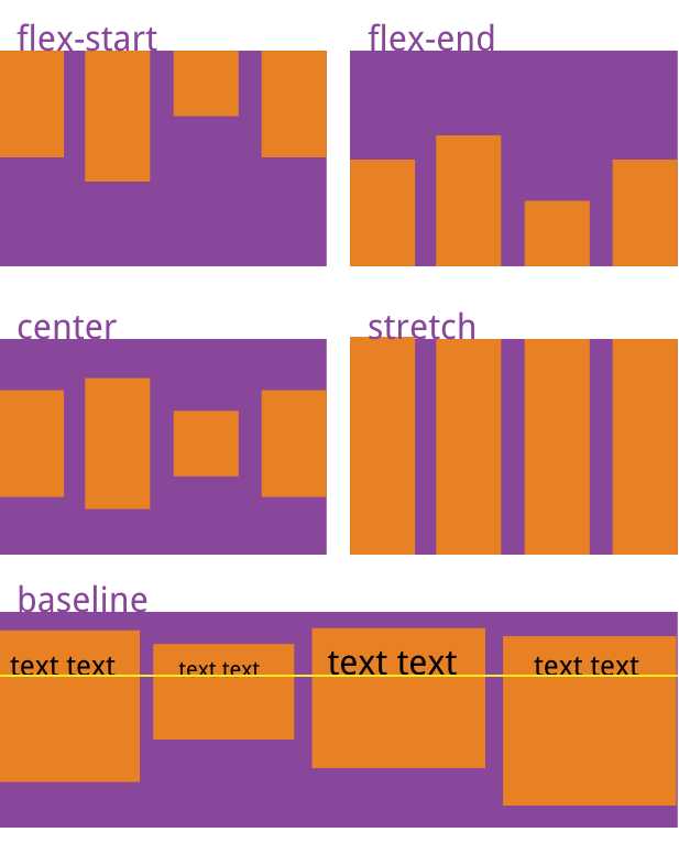
stretch(默认值):如果项目未设置高度或设为auto,将占满整个容器的高度
<!DOCTYPE html>
<html lang="en">

<head>
    <meta charset="UTF-8">
    <meta name="viewport" content="width=device-width, initial-scale=1.0">
    <meta http-equiv="X-UA-Compatible" content="ie=edge">
    <title>Document</title>
</head>
<style>
    .flex-container {
        display: flex;
        flex-direction: row-reverse;
        justify-content: space-between;
        align-items: center
    }

    .flex-container {
        height: 60px;
        background-color: #F0f0f0;
    }

    .flex-container .flex-item {
        background-color: #B1FF84;
        height: 30px;
        width: 30px;
        text-align: center;
        line-height: 30px;
    }

    .flex-container .flex-item:first-child {
        background-color: #F5DE25;
    }

    .flex-container .flex-item:last-child {
        background-color: #90D9F7;
    }
</style>

<body>
    <div class="flex-container">
        <div class="flex-item">1</div>
        <div class="flex-item">2</div>
        <div class="flex-item">3</div>
    </div>
</body>

</html>
可以在某个特定的 flex 项上使用 align-self CSS 属性,来使该特定的 flex 项与容器中的其他 flex 项进行对齐。
<!DOCTYPE html>
<html lang="en">

<head>
    <meta charset="UTF-8">
    <meta name="viewport" content="width=device-width, initial-scale=1.0">
    <meta http-equiv="X-UA-Compatible" content="ie=edge">
    <title>Document</title>
</head>
<style>
    .flex-container {
        display: flex;
        flex-direction: row-reverse;
        justify-content: space-between;
        align-items: center
    }

    .flex-bottom {
        align-self: flex-end
    }

    .flex-container {
        height: 60px;
        background-color: #F0f0f0;
    }

    .flex-container .flex-item {
        background-color: #B1FF84;
        height: 30px;
        width: 30px;
        text-align: center;
        line-height: 30px;
    }

    .flex-container .flex-item:first-child {
        background-color: #F5DE25;
    }

    .flex-container .flex-item:last-child {
        background-color: #90D9F7;
    }
</style>

<body>
    <div class="flex-container">
        <div class="flex-item">1</div>
        <div class="flex-item">2</div>
        <div class="flex-item flex-bottom">3</div>
    </div>
</body>

</html>
原文:https://www.cnblogs.com/cowboybusy/p/11119468.html